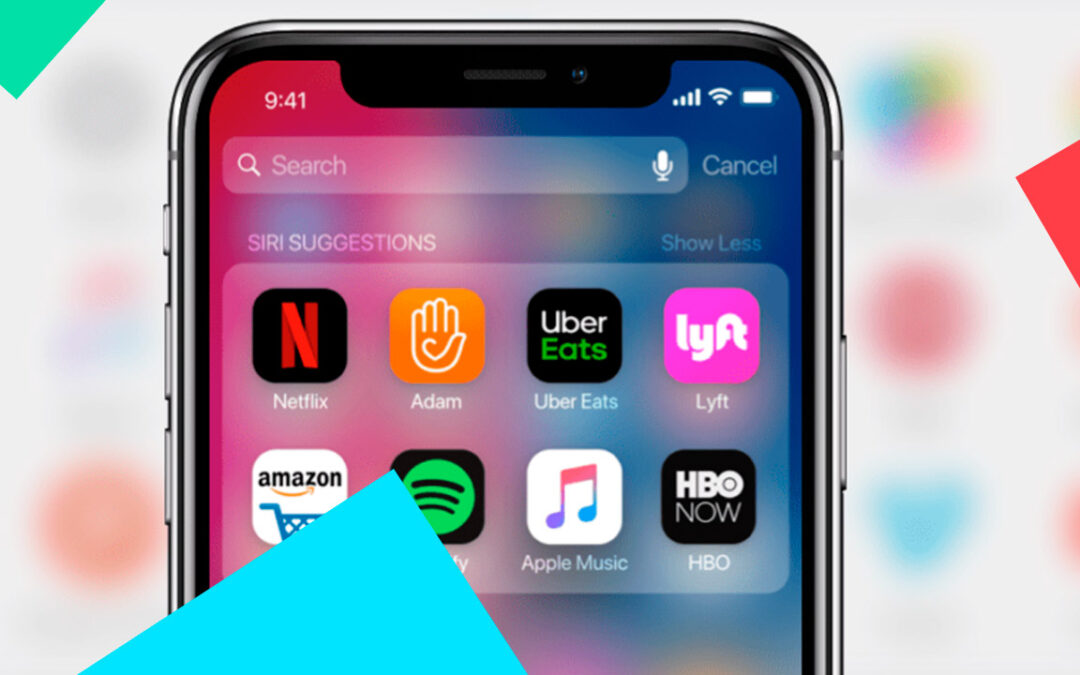
The appearance of a mobile app and the interaction experience that users have when using it are both important factors in developing a successful product. To fully reveal a mobile app’s business potential, it must be easy to use, appealing to the eye, and understandable to the target audience.
A good UI/UX design will help you achieve this goal. In this article, we will share some mobile app design tips in the hopes that they will assist you in creating a truly high-quality product that users will enjoy.
Do not regard these documents as unchangeable. They are only suggestions, not hard and fast rules. They are here to assist you, but you are not required to follow them at all times and in all places. You can even mix and match recommendations and elements from one platform to the other.
The 7 Most Important Principles of Good UI/UX Design for Mobile Apps
1. Assist in problem solving
Unlike art, any mobile app design exists to solve a specific problem. Users use apps to solve problems or find answers to questions. If you can help them do it quickly and easily, they will be satisfied and may even recommend the app to their friends.
2. Observe the Guidelines
Even for new users, working with apps should be habitual and intuitive. As a result, Google and Apple encourage developers to standardize native app interfaces.
For Android, Google Material Design was compiled, and for iOS, the Human Interface Guidelines were created. Add these pages to your bookmarks because you will need them during your work. Remember that these documents are regularly updated, so check them out from time to time to stay up to date on any changes.
3. UI Elements with Labels
If the icon is not labeled, it is likely that users will not understand what it is for. Despite UX designers’ expectations, even icons with obvious functions (for example, a hamburger menu — a column of three horizontal lines) can perplex users.
Things will get even worse if your app has completely different icons, as users will struggle to understand what they mean. As a result, label your interface elements so that users are not perplexed.
4. Observe the Order
The best way to give users time to comfortably adapt to your app is to introduce them to it gradually. Users follow a predefined path to find solutions to their problems. Consistency boosts conversion rates and creates a positive user experience.
Here are a few examples of how design consistency manifests itself:
- Registration is done in stages. Users enter their email address, enter a verification code they received in the mail, and gain access to their personal account.
- Visual coherence. Typography, buttons, and blocks all work together to form a cohesive whole.
- The consistency of style. App versions for Android and iOS are designed to be as similar as possible, allowing users to avoid discomfort when switching from one system to another.
5. Make use of micro-interactions.
These are minor occurrences within a larger system. They draw attention, convey information, and mitigate negative expectation impressions.
Here are some examples:
- Navigation while scrolling the content; Animation after clicking the icon;
- Data entry visualization; event indication (changing the number of unread letters or notifications). A picture of a credit card is frequently included on a payment form. The numbers appear on the image automatically after filling out the form fields;
- Invitation to action (CTA).
Micro-interactions are effective because they provide feedback and a clear understanding that the operation has been completed or is in the process of being resolved.
6. Adapt to Your Audience
It is best to know who your target audience is so that you can tailor your design accordingly. Consider all of the parameters you are aware of: your age and gender, your preferences and interests, and the most popular services. With this information, you can easily simulate users’ paths and anticipate their desires and expectations from the interface.
Consider the following question: why does the user open your app? Create the design based on the response. If a user launches the app solely to order food delivery services, the appropriate functionality for this action should be located right on the main page.
7. Better Is Simpler
Do not overcomplicate your interface with unnecessary details and elements, even if they appear appealing to you. The mobile app design should allow users to accomplish their goals with the fewest number of clicks, text reads, and so on.
The same is true for functionality. There is no need to overburden your product with unnecessary features. It is preferable to develop the bare minimum while ensuring continuous operation.
We hope you find these tips useful and can put them to use while working on your mobile app.
If you are interested in obtaining a professional APP please do not hesitate to contact us.


0 Comments