
Do You Have An Easy-to-Use Website Design?
By far the best website design strategy is simple website design. This is a fact supported by numerous case studies and focus groups.
When it comes to your company’s website, simplifying your website design can mean the difference between success and failure!
You’ve most likely heard the adage “work smarter, not harder.”
When it comes to building your company’s website, a simple website design is a wise strategy.
It not only takes less time to create a simple, high-quality, organized, streamlined site design, but it can also increase your conversions!
The goal of effective website design is to communicate as much as possible using as few elements as possible.
Here are nine reasons why simple website design is the best:
9 Arguments for Choosing a Simple Website Design

1. A simple website design increases conversions
Study after study has shown that simple website design leads to higher conversion rates than complicated websites with a lot of ornamentation.
Many eCommerce store owners report significant sales increases after simplifying their websites.
It can be tempting to try to promote sales by using all of the bells and whistles, but going too far can have the opposite effect.
People dislike it when they believe someone is attempting to sell them something.
In fact, flashy page designs are known to deter conversions.
Meanwhile, sites with minimalist design elements make it simple for visitors to make purchases…
…or locate critical information without feeling pressured to do so.
This is not to say that your website should be devoid of images, videos, or vibrant colors.
Rather, use these elements sparingly and in ways that highlight key conversion points or CTAs, such as:
“Add to cart” buttons, lead forms, newsletter subscription boxes, or “contact us” tabs are all examples of interactive elements.
However, building a simple website design with minimal ornamentation allows users to click the largest.
The quickest way to get in touch with one of our business development specialists about our social media advertising services.
This page has been conversion-optimized.
If you want to increase sales, consider optimizing your website by removing any unnecessary details that may divert users’ attention away from key conversion points.
Also, learn how to use white space effectively to create a visually appealing website that is both professional and easy to navigate.
Simple website design focuses your site’s attention on conversion points while leaving little room for users to stray away, resulting in increased sales.
2. A straightforward website design is timeless
Time moves quickly in the world of website design.
Web design trends come and go, making new styles obsolete in an instant.
Simple website design is one of the few trends that has remained relevant since the advent of the Internet.
Using a simple design means you won’t have to update your site as frequently because it won’t become outdated as quickly.
Because they chose a timeless, minimalist design theme, some business owners can go years without making changes to their websites.
Other business owners, on the other hand, must constantly update their websites to keep up with evolving modern design trends.
3. You do not want to annoy your website visitors
If someone clicked on your website, it was for a specific reason.
However, that reason was most likely not to admire your exceptional graphic design abilities.
They know exactly what they want to find on your website, and you, as the website owner, know what they want to find.
Your goal should be to make it as simple as possible for visitors to find what they’re looking for without having to scroll endlessly.
That is why the menu or navigation bar is one of the most important aspects of a website.
Brands, on the other hand, continue to include and cram all of their pages into the main menu bar.
And this can actually confuse users rather than help them find the page they’re looking for.
The number of tabs in the main navigation bar should be at least six, with only a few options in each.
Taking away unnecessary distractions from your website results in a more clear, concise, and streamlined user experience.
Simplifying your website is the simplest way to improve user experience.
Don’t make your website visitors think too hard.
According to the Choice Paradox, the more options you give someone, the less likely they are to make any choice at all.
If you overwhelm your website visitors with a plethora of clickable buttons and hyperlinks, eye-catching images, videos, gifs, and other elements.
They are far less likely to click where you want them to click.
Check out your website. Which features can you get rid of in order to simplify your website design?
Certain features may be more distracting and unimportant than you believe.
A pop-up asking users to sign up for your newsletter is a great example of this. This may appear to be a good idea.
What if that person was about to make a purchase and you interrupted them with your pop-up?
Not only are they unlikely to make a purchase now, but they are also likely to become irritated and even less likely to sign up for your newsletter…
…than if the form had been at the bottom of the page, where they expected to find it.
To take it a step further, no one will read every word on your website.
It’s best to put the most important information up front and center, and to leave out any less important information that someone might read instead.
The best way to ensure that people read the information you want them to read is to remove all unnecessary information and streamline your website.
When you offer too many options for people to look at and interact with on your website, it can lead to a lot of confusion.
When it comes to navigating your site, users may not know where to look or even where to begin.
With effective use of white space and clear navigation tools, simple website design allows you to guide users’ eyes along with your website.
4. Simpler designs meet the expectations of users
People have certain expectations when it comes to the design of specific types of websites.
Have you noticed that the layouts and design choices on the majority of your favorite e-commerce sites are very similar?
This is due to the fact that they are adhering to the expected layout pattern in order to maximize conversions.
If your website visitors already know where to click to get to the information they need on your site.
They are more likely to convert into customers even if they have never visited your site before.
Users usually expect to see a few items on specific pages of a website. This includes the following:
a clickable logo in the upper left corner that takes them back to the homepage, a menu or navigation bar at the top of each page, and contact information at the bottom of the page
Other popular conventions you might want to use on your site include shopping cart icons for users…
If you run an eCommerce store, they will be able to view their cart. You can also include a search bar near the top of the page.
Websites that deviate too far from standard layouts risk confusing visitors.
A simple website design that follows expected conventions carries a certain amount of credibility.
When your website is both familiar and simple to use, it eliminates the learning curve and accelerates the process of converting a visitor into a customer.
No one will be impressed by your creativity if your website does not follow standard web design patterns.
They’ll only be puzzled as to why certain buttons or pieces of information were not where they expected to be.
5. A simple website design is appealing to everyone
According to a Google study, visually complex websites are consistently rated as less appealing than simple website designs.
A simple website design can quickly establish trust with visitors to your website.
Meanwhile, websites with too many images or too many different colors and fonts give off a spammy first impression.
No matter who your target audience is, they are more likely to trust and navigate your website if it is designed in a minimalist style.
Older audiences may struggle to read fancy fonts and text on brightly colored backgrounds.
Also, dense blocks of text with little white space.
Similarly, younger audiences are more likely to be distracted by a plethora of images and videos.
Simplifying your website is the best way to optimize it for all audiences.
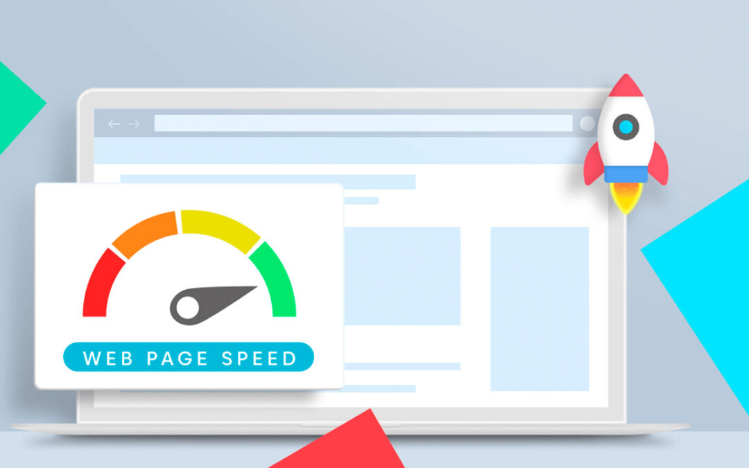
6. Quicker loading of simple websites
Fast load times are critical not only for a good user experience but also for good SEO rankings.
Users, according to experts, tend to abandon websites that take more than three seconds to load.
That may not appear to be much time, but in the digital age, people have come to expect information at the click of a button.
It is not an option to wait for a web page to load.
Furthermore, Google incorporates site speed into its search engine optimization ranking algorithm.
The faster your website can load, the higher it will rank when people search for related keywords.
A simple and well-organized website structure can work wonders for your website’s search engine ranking.
Too many images, gifs, videos, and other media on your website can significantly slow its load speed.
By choosing a simpler website design, you can ensure that your website loads much faster.
Simple designs reduce the workload on your server, which can further improve load times.
To host videos and large image files, massive amounts of space are required.
And removing them from your website is one of the simplest and quickest ways to improve its load speed.
Most hosting companies will also charge you based on how much space your website takes up on their server.
So, simplifying your website can not only improve load time and increase sales, but it can also save you money!
7. A straightforward website design appears professional and trustworthy
A clean, simple website design establishes the legitimacy of your company. It builds trust and increases the likelihood of users returning to your site in the future.
According to a recent poll, 48 percent of people judge a company’s credibility based on its website design.
In fact, the vast majority of Internet users report that the appearance of a website has a direct impact on how much they trust a company.
So, how do you replicate this lovely but straightforward design on your own website? White space is the answer.
White space on your website refers to all of the blank space that appears in margins as well as between words, letters, images, and headlines.
The effective use of white space allows users to focus on one aspect of your website at a time, which speeds up the conversion process.
The webpage shown above is an excellent example of how to use white space effectively (and how white space does not actually have to be white).
Between the headline, body text, image, and call-to-action button, there is plenty of white space.
This enables the eye to easily navigate the page and locate the call to action.
People are more likely to make a purchase or fill out a lead form on a website that appears professional.
The simplest way to achieve a professional appearance on your site is to use a simple website design with…
…a lot of white space and judicious use of fonts and media.
8. A simple website design is simple to modify
The more complicated your website, the more chances for things to go wrong.
Making changes to a highly detailed site can also be a nightmare.
Keeping your website’s code clean and simple can save you…
…or your web developer countless hours in the future when website maintenance is required.
There will come a time when you will need to make changes to your website.
The simpler your website design, whether you need to fix a bug or add new information, the easier it will be to make those updates.
Simple website design is essential not only for user-friendly navigation and conversion-centered layout, but also for easy routine maintenance!
9. A simple website design has been shown to be effective
There’s a reason why most major brands’ logos have become more simplified in recent years.
Simple designs are superior to complex designs!
Check out the images below to see how some of the world’s most well-known brands have simplified their logos over time:
These same design simplification ideas can be applied to your company’s website! Have you noticed how Google switched from a serif to a sans serif font?
Because they are more simple, sans serif fonts are easier for most people to read.
Dropbox and Spotify both chose not to include text in their logos because the images speak for themselves.
When possible, use images or infographics to convey information on your website rather than large blocks of text.
As long as the images aren’t too complicated, this can be an excellent way to streamline a web page and encourage more people to look at it…
…the data you’re providing.
Conclusions
Simple website design is always the most effective website design strategy for you, no matter what industry you’re in.
By simplifying the design of your website, you can increase conversions, improve user experience, save money on web hosting, and even improve SEO.
Do you require assistance in simplifying your website?
Contact us today to get the help of our expert web designers and to learn more about our website design services!


0 Comments